2027 Decorative Trim Trends: Champagne Gold in Hotel Design
The matte black decade is closing. What replaces it is not polished gold — it is a family of low-chroma, satin, warm metals used as a line rather than a surface, and specified with tolerances nobody used to bother writing.
Design & specification · JECA Decor, Foshan · 11 min read
Walk into a hotel that opened in 2019 and one that will open in 2027, and the furniture is not what tells you the difference. One is edged in anthracite, designed for a photograph at midday. The other catches light along every corner at nine in the evening, under a 2700K downlight, and everything the light touches is warm and slightly soft.
Below: seven directions actually appearing in specification documents now, the three processes that produce a champagne gold, and the place where more projects fail than anywhere else — matching one named colour across three suppliers.
The short answers
| Is gold still in for 2027? | Yes, but satin and desaturated. Mirror gold is not. |
| The one finish to specify if unsure | Brushed PVD champagne on 304, 15–25 gloss units |
| Most durable warm finish | PVD on stainless, 1500–2500 HV |
| Least durable warm finish | Powder coat — repeatable, but reads as paint at 300 mm |
| Rose gold outdoors or at a pool | Not on 304. 316 and a thicker layer, or move it inside. |
| Standard colour tolerance | ΔE ≤ 2.0 vs master; ≤ 1.5 when two metals are within a metre |
| Number of metals per room | Two, separated by gloss rather than by hue |
Why the metal changed
Matte black earned its decade. Powder coating is cheap and repeatable, it hides fingerprints better than anything else, and it gave designers a graphic edge in an era of interiors built for social media. It also matched the warehouse-conversion industrial-luxe language that ran from about 2014 to 2022.
Three things pushed against it.
The palette moved to warm neutrals
Warm stone, clay, olive, terracotta, chocolate. A cold black edge fights all of them. Once the field colour is warm, the line has to be warm too, or it reads as a mistake rather than a contrast.
The light moved warmer and lower
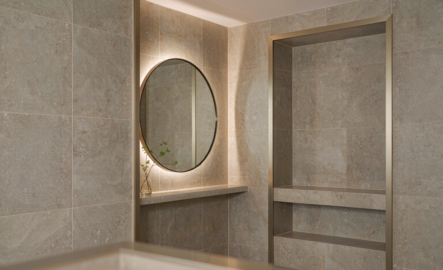
Matte black under 2700K has almost no specular response left — it reads as a void rather than a line. The same detail in satin champagne picks up the downlight and draws the corner. A finish that photographs well under 5000K can disappear entirely under the lighting actually installed.
The brief moved toward spa bathrooms
The industry now talks about hotelification: guest bathrooms specified like spa bathrooms, with the material language that implies. Spa bathrooms have never been edged in matte black.
There is a colour logic underneath. WGSN and Coloro named Luminous Blue as their 2027 colour of the year — a saturated, confident blue. Saturated blue needs a warm metal to sit against or it goes clinical. It is the same reason deep green marble and unlacquered brass have been paired for a century: the warm line is what stops the cool field from reading as cold.
Seven directions for 2027, and what each one costs you
01 · Satin beats mirror
Gloss is retreating everywhere — stone, joinery, metal. The deco revival arrived with rounded corners and brushed rather than mirror gold. This is also the single best commercial decision on the list: a brushed finish hides site scratches, and site damage is the leading cause of snagging on a metal trim installation. A mirror finish on a corridor corner has a working life measured in weeks.
Cost effect: neutral to negative. Brushed is no more expensive than polished and considerably cheaper than replacing damaged sections at handover.
02 · Champagne gold, desaturated
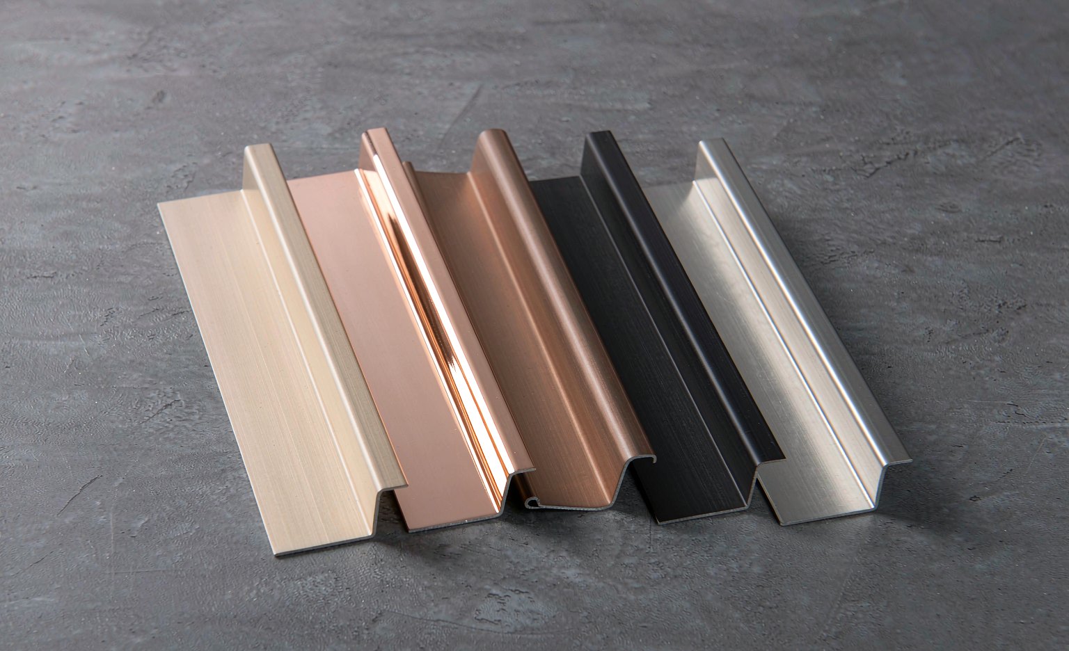
Not yellow gold, not brass. Pale, low chroma, slightly greenish or pinkish depending on the light, and satin. It reads as expensive without announcing itself, which is exactly the brief for quiet luxury. The catch is that champagne is not a colour code — see the three processes below, because the process decides whether your champagne survives a hotel.
Cost effect: a batch process, so it multiplies MOQ by the number of colours and adds a finishing queue to the lead time.
03 · Rose gold, used as an accent
Copper in the deposition target shifts the hue pinker, which is more flattering against skin, more forgiving next to warm stone, and better under low light than yellow gold. Used as an accent — a mirror frame, a bar shelf edge, a vanity trim — it is the most photogenic warm metal available. Used as a field, it is a maintenance liability. Details in the failure list below.
Cost effect: similar to champagne, with tighter colour control needed because hue is more sensitive at high copper content.
04 · Warm dark instead of black
Where a dark edge is still wanted, it is bronze, graphite or blackened steel rather than pure black. Subtle in a sample, obvious in a room: warm darks keep a relationship with the timber and stone around them, and they photograph without going flat.
Cost effect: typically stocks alongside black in the same process, so no minimum penalty if you consolidate.
05 · Two metals, separated by gloss
Mixed metals are normal now, with an informal ceiling of two per room. The specifier’s version of that rule is practical rather than aesthetic: separate the two by gloss or by scale, never let them compete on hue. A satin trim against a polished tap is a composition. A satin trim against a satin tap half a shade warmer is an argument nobody wins at handover. If you are comparing warm metals against traditional brass, our brass trim specification guide covers where the two diverge on maintenance.
Cost effect: neutral. It is a specification discipline, not a product.
06 · Colour as the counterpoint
With saturated blues and deep greens returning to tile and joinery, trim becomes the element that makes the colour work. A champagne gold edge on a blue zellige field is not decoration — it is the warm line that keeps the blue from reading as cold. Expect trim specified as an accent against colour rather than as a neutral against neutrals. For joint geometry in these schemes, the T-profile versus U-profile comparison is the place to start.
Cost effect: none, but it raises the visibility of the profile, so tolerance quality matters more.
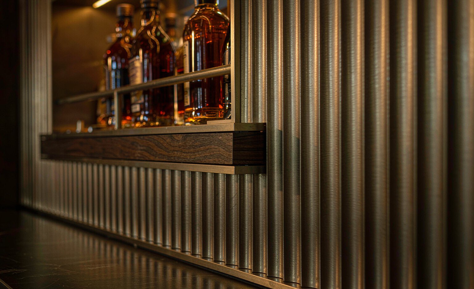
07 · Fluting, reeding, and light in the profile
Reeded and fluted sections, ribbed metal panels, and trim that doubles as a light carrier. The last one carries a trap: a warm metal under a 4000K LED goes sickly, and champagne gold under a low-CRI strip loses its warmth entirely. Specify 2700–3000K at CRI 90 or above whenever trim and light sit inside the same detail — otherwise the finish you approved is not the finish the guest sees. See our notes on architectural LED profiles for the detail side.
Cost effect: the highest of the seven. Fluted tooling is custom, and integrated lighting doubles the component count and the coordination.
Three routes to champagne gold, and why they are not interchangeable
This is where specifications break. A designer writes “champagne gold” on a finish schedule, three suppliers quote it, and three different materials arrive. Each route gives you a different colour space, a different durability profile and a different cost curve.
| Route | What you are buying | Where it wins / fails |
|---|---|---|
| PVD on stainless | A thin ceramic-metal layer deposited in vacuum on 304 or 316. Hardness 1500–2500 HV, so it resists scratching far better than the steel beneath. Hue tuned by gas flow and target composition. | Wins on durability and on matching hand-contact hardware. Fails on cost at small volumes and on batch consistency if ΔE is not enforced. |
| Anodised aluminium | Dye absorbed into an electrochemically grown oxide layer, then sealed. Lighter than stainless, cheaper at volume, excellent on 6063-T5. | Wins on weight and price for interior work at scale. Fails under sustained UV, and colour depth is bounded by oxide thickness — pale champagne is easier than deep bronze. |
| Powder coating | The most repeatable colour of the three, and the only one that hits a tight RAL or Pantone on the first attempt. | Wins on consistency and lead time. Fails on depth: no metallic orientation, so at 300 mm it reads as paint. Acceptable on a service corridor skirting; wrong on an edge you want guests to notice. |
Where projects actually fail: colour matching, not durability
Almost every gold-finish complaint on a hotel traces to a matching failure. The trim is PVD on stainless, the door hardware is plated brass, the light fittings are powder coated. Three processes, three colour spaces, and a client in the bathroom at handover looking at a warm edge that does not agree with the warm tap.
You cannot make three processes agree exactly. You can stop pretending they will:
- Nominate one master. One approved physical sample, held by the architect, referenced in writing by every supplier.
- Write the tolerance. ΔE ≤ 2.0 against the master for elements seen separately; ΔE ≤ 1.5 where trim and hardware sit within a metre of each other.
- Approve under project light. Champagne approved under 5000K office lighting will look green under the 2700K actually installed. View samples under both, minimum.
- Separate by gloss where hue cannot be matched. Mirror hardware against satin trim reads as intentional. Two satins half a shade apart read as a mistake.
Five finishes that fail in hotels, and why
- Mirror gold at floor level or trolley height. Every scuff shows, and scuffs are inevitable. Mirror belongs above hand height or on a wall panel, not on a corridor skirting.
- Rose gold in a pool or spa wet zone. Copper-rich layers are attacked preferentially by chlorides. If the scheme demands it, 316 substrate and a stated salt-spray threshold — otherwise move it out of the wet zone.
- A 0.2–0.3 µm decorative layer on a door push plate. Coating thickness decides service life on hand-contact surfaces. Ask for 1 µm and up, and expect to pay for it.
- Powder-coated “gold” on a feature edge. Hits the colour, misses the material. At close range the absence of metallic depth is obvious, and it is the most common substitution made without asking.
- Champagne gold under a 4000K or low-CRI light source. The finish is fine; the light is wrong. A warm metal needs warm, high-CRI light or the whole palette turns slightly ill.
Zone by zone: where each finish survives
A finish schedule written for a mood board and one written for a maintenance contract are different documents. This is the second one.
| Zone | Specify this | Because |
|---|---|---|
| Lobby / reception | Brushed PVD champagne on 304 | High touch, high cleaning frequency. Film thickness and adhesion matter more than colour accuracy. No mirror. |
| Guest bathroom | Satin PVD on 304, 15–25 GU | Niche frames and external corners are the visible details. Limescale and acidic descalers are the real enemy — specify the cleaner alongside the finish. |
| Corridor / skirting | Brushed; replaceable sections at trolley height | Luggage damage is not a coating problem, it is a design problem. |
| Bar / restaurant | Rose or mirror gold as accent only | Grease and polishing compound both attack thin decorative layers. Keep mirror above hand height. |
| Spa / pool | 316 substrate; no copper-rich rose gold | Chlorine and salt spray find every weakness in the layer within a season. |
| Guest room joinery | Thin sections, tight tolerances | Colour must be agreed with the door hardware before either is ordered. |
| Ceiling runs | Check the fire classification of the coated product | Solid metal achieves A1; the coating system is the part that gets asked about. |
The eight lines that make the finish arrive as designed
- Substrate grade and temper — 304, 316 or 6063-T5.
- Finish process named explicitly: PVD, anodised or powder. Never just “gold”.
- Master sample reference, plus ΔE tolerance and gloss level in gloss units.
- Coating thickness in micrometres, measured by XRF.
- Adhesion (ISO 2409, class 1 or better) and salt spray hours (ISO 9227), numbers stated.
- Reaction to fire classification where the run is large.
- Protective film type, and a maximum removal window. Film left on through a summer transfers adhesive into the finish, and no solvent gets it out cleanly.
- Packing standard for site delivery — where most snagging on trim actually originates.
The eighteen-month question. Ask what the finish will look like after eighteen months of housekeeping. Not cleaning — housekeeping, which in a hotel means an acidic bathroom descaler, an abrasive cream on a microfibre cloth, and eleven minutes per room. A satin finish survives that. A mirror finish on a horizontal surface does not, and neither does a 0.2 µm layer. Designing for the cleaning regime is part of designing the finish.
For distributors and contractors: what to stock for 2027
If you are holding inventory rather than specifying a single project, the 2027 palette creates a specific stocking problem: demand is shifting toward finishes that cannot be held as stock, because every colour is a batch.
- Stock the structure, make the colour. Keep deep inventory of natural brushed stainless, brushed black and matte silver profiles in standard lengths — these still carry the volume, and they ship from stock in days. Treat champagne and rose gold as made-to-order against project schedules.
- Hold a colour sample kit, not colour stock. A physical fan of the six warm finishes, on the actual substrate, closes more specification conversations than a catalogue page and costs a fraction of holding three colours in five profiles.
- Run a three-colour maximum across the range. Two warm neutrals plus one accent. Distributors who carry eight warm variants end up discounting four of them.
- Quote gold with the queue in it. A champagne gold quotation that ignores the finishing batch is a promise you cannot keep. Build one batch cycle into the lead time you publish, and publish it honestly — project buyers plan around a stated week, and punish a surprise.
- Use bathroom systems as the anchor. Niche frames, corner profiles and shelf units in the same finish sell together and pull the trim with them; our integrated wet-room niche and wall cladding systems are the usual entry point for that conversation.
Cost and lead time: gold is not a stock colour
This catches projects in the final month, so it deserves its own paragraph. Standard natural stainless and standard anodised silver ship from stock. A named champagne or rose gold usually does not — it is a batch process run to order, in a vacuum chamber or a dye bath set up for your colour.
That adds a finishing queue to the lead time, and it multiplies MOQ by the number of colours nominated. Five profiles in champagne gold is one batch. Five profiles in champagne, rose gold and graphite is three batches, each with its own minimum, its own colour approval, and its own chance of arriving half a shade off the others.
The design-side fix is simple and almost always improves the scheme: pick two warm metals, and let one of them be the frame colour across the whole project. It reduces cost, shortens the lead time, and makes the palette look like a decision rather than a collection. For the sourcing side — minimums, batch scheduling, and how a finishing queue lands on a project calendar — see our guide to importing tile trim from China.
Questions that come up in specification meetings
Will champagne gold date as badly as polished brass did?
Polished brass dated because it was applied to everything, at full gloss, in a period that mistrusted restraint. Satin champagne is being used as a line rather than a surface, at low gloss, against warm neutrals — a much longer-lived proposition. The risk is not the colour, it is over-application: a room where every edge is gold has the same problem as a room where every edge is black.
Can I get a champagne gold that matches across stainless and aluminium?
Close, not identical. PVD on stainless and anodised aluminium sit in different colour spaces, and the substrate alters the perceived hue. Keep the two materials apart in the room, or run the aluminium elements through PVD as well rather than anodising. Either way, write ΔE against one master.
How long does a PVD gold finish actually last in a hotel?
Longer than the first refurbishment cycle, if the layer is an architectural thickness and the cleaning regime is not abrasive. Most field failures trace to three causes: a decorative layer under 0.3 µm on a hand-contact surface, a daily acidic cleaner, or installation damage that was never touched up. None are the coating’s fault, and all three are preventable at specification stage.
Is rose gold safe for a pool area?
Not as copper-rich PVD over 304, which is the combination most often quoted. If rose gold is a hard requirement at a pool it needs a 316 substrate, a thicker layer, and a salt-spray threshold in the order. In most schemes the better answer is to move the rose gold out of the wet zone entirely.
Brushed or polished, if the client wants “gold”?
Brushed, unless the surface is vertical, above hand height, and away from traffic. Polished gold is a finish for surfaces nobody touches; in a hotel that is a short list. If the client is set on shine, put it on a panel and keep the working edges satin.
Trends are easy to describe and hard to build. The difference between a scheme that still looks like the render in 2029 and one that looks tired in 2028 is almost never the colour — it is the process behind the colour, the tolerance nobody wrote down, and the cleaning chemical nobody asked about.
We manufacture stainless and aluminium decorative profiles in Foshan, including PVD champagne and rose gold decorative profiles and the niche and corner systems they are usually specified with. If you are building a 2027 finish schedule, send it to us and we will tell you which lines are straightforward, which need a batch plan, and which ones we would argue with you about.
Contact JECA DECOR
Explore JECA DECOR products
Ceiling Profiles
ALE8074 Ceiling Profiles: The Ultimate Recessed Lighting Cha...
When executing modern interior lighting projects, integrating architectural light strips seamlessly into drywalls and ceilings is one of the most effective ways to elevate overall spatial aestheti...
Niche without Partition
SBK304-600W-300H Stainless Steel Niche without Partition: Pr...
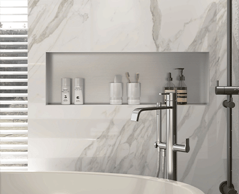
In modern interior design and architectural space planning, integrating minimalist, recessed storage is an effective way to optimize utility without cluttering floor or wall space. Traditional wal...
Obliquity Profiles and Glass Profiles
AF7717 Obliquity Profiles and Glass-Profiles: Premium Alumin...
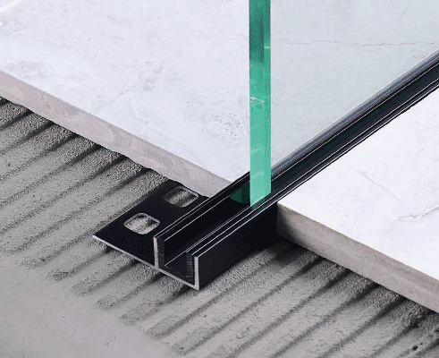
AF7717 is an aluminium 6063 glass channel with a PVC component, 10 × 12.6 × 2500mm, formed in 1.2–1.8mm and finished by anodising or powder coating. It holds a fixed glass panel — shower screen, pa...
Contact JECA Decor
Custom Solutions for Global Projects
Established in 2012, we specialize in high-end decorative accessories. With over ten years of industry experience, we are committed to the product philosophy of "Safety, Practicality, and Advanced Technology".
- ISO9001 Quality Management System
- EU CE certification
- IPMS (Intellectual Property Management System)
- Australian, American, and Canadian standards
We are located in Foshan, Guangdong, just under one and a half hours' drive from Guangzhou Baiyun International Airport, in the heart of the Pearl River Delta Economic Zone.
If you are interested in any of our products, or would like to discuss a custom order, please feel free to contact us. We look forward to building long-term business relationships with clients around the world.